Hebrew version · English chapter index
Previous chapter · Next chapter
On the touch screen, you can swipe right to the next chapter and left to the previous chapter.
This optional lesson can be completed alongside CollectCircles 1 or revisited later. We will build the same activity_main.xml, this time mainly using the mouse and Android Studio’s Layout Editor.
Before you start
If you created the project yourself, choose the Empty Views Activity template and name the activity MainActivity. The template already creates:
MainActivity.java;activity_main.xml;- a root
ConstraintLayout; - an initial
TextViewwith the text Hello World.
In this lesson, you do not add another Activity. You only change the screen created by the template.
The exact appearance of the buttons may vary slightly between Android Studio versions, but the names Palette, Component Tree, Attributes, Design, and Blueprint remain similar.
What should be prepared
Before building the screen:
- Activate View Binding as explained in lesson 1.
- Add the strings and colors to
strings.xmlandcolors.xml. - Create
GameBoardView.java. - Choose the menu Build → Assemble Project.
That last build matters: Android Studio can show GameBoardView in Palette → Project only after it recognizes the class.
1. Open the screen editor
In the Android window open:
app > res > layout > activity_main.xml
Select Design at the top right of the editor. If you see only XML, click the Design icon or choose Split to see the code and preview together.
On the design surface’s toolbar, choose Design + Blueprint:
- Design shows roughly how the screen will look.
- Blueprint highlights the component boundaries and constraint lines.
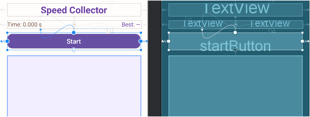
The image shows the same screen in both views. The wavy lines and circles in Blueprint are editor tools; they do not appear in the app.
Open the following three windows if they are closed:
- Palette - list of components that can be dragged;
- Component Tree - the list of components that are already on the screen;
- Attributes - the properties and constraints of the selected component.
If the tool windows take up too much space, press Ctrl+Shift+F12 to hide or restore them. This gives the Layout Editor more room.
2. Understand the four types of handles
Select a component on the screen. Handles appear around it:
- Corner squares let you resize it manually;
- A circle on the left creates a horizontal constraint to the left;
- A circle on the right creates a horizontal constraint to the right;
- A circle at the top or bottom creates a vertical constraint;
- For text elements you can also display a Baseline handle.
To create a constraint:
- Press and hold a circle on the component side.
- Drag it to the appropriate side of the parent or other component.
- Release when the connection point is highlighted.
The position where you placed a component in the editor is not a constraint. Each element needs at least one horizontal constraint and one vertical constraint. A component that looks correct in the editor but is not linked may jump to the upper left corner at runtime.
If you created an incorrect constraint:
- Select its line and press
Delete; or - Click on the connection point in the Constraint Widget chart in the Attributes window.
It is recommended to leave Autoconnect off and create the connections manually. That way we know exactly why each component is in its place.
3. Clear the template screen
In the Component Tree, highlight the Hello World TextView and click Delete.
Select the root ConstraintLayout and set these values in the Attributes window:
| Attribute | Value |
|---|---|
id |
main |
background |
@color/screen_background |
paddingHorizontal |
20dp |
You can use the search icon at the top of Attributes to find an attribute.
4. Add the title
- In Palette open Common.
- Drag
TextViewto the top of the screen. - In the Attributes window define:
| Attribute | Value |
|---|---|
id |
titleText |
text |
@string/game_title |
textSize |
26sp |
textStyle |
bold |
textColor |
@color/title_purple |
gravity |
center |
layout_width |
0dp - Match Constraints |
layout_height |
wrap_content |
Now create three constraints:
- Connect the title’s left side to the parent’s left side.
- Connect the title’s right side to the parent’s right side.
- Connect the title’s top to the parent’s top.
In the Constraint Widget, set a top margin of 20dp.
Why width 0dp?
In ConstraintLayout, the value 0dp means Match Constraints: the component is stretched between the left and right constraints. It is not zero width.
5. Add the two time labels
Drag two more TextView components below the title.
For the left label set:
| Attribute | Value |
|---|---|
id |
elapsedTimeText |
text |
@string/elapsed_time_initial |
textSize |
16sp |
textColor |
@color/time_brown |
gravity |
start |
layout_width |
0dp |
layout_height |
wrap_content |
For the right label set:
| Attribute | Value |
|---|---|
id |
bestTimeText |
text |
@string/best_time_initial |
textSize |
16sp |
textColor |
@color/title_purple |
gravity |
end |
layout_width |
0dp |
layout_height |
wrap_content |
Create a horizontal chain
Connect with the round handles:
- Connect the left side of
elapsedTimeTextto the parent’s left side. - Connect the right side of
elapsedTimeTextto the left side ofbestTimeText. - Connect the left side of
bestTimeTextto the right side ofelapsedTimeText. - Connect the right side of
bestTimeTextto the parent’s right side.
Both components have a width of 0dp, so the chain divides the row’s width between them.
Connect the row to the title
Connect the top of elapsedTimeText to the bottom of titleText. Set a top margin of 12dp.
To align the two texts exactly:
- Right click on
bestTimeText. - Select Show Baseline.
- Drag its baseline handle to
elapsedTimeText’s baseline.
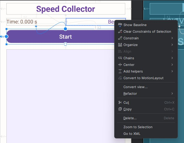
Baseline is the imaginary line on which the letters sit. It is more accurate than connecting the upper edges of two text elements.
6. Add the Start button
In Palette open Buttons and drag Button below the time labels.
Set:
| Attribute | Value |
|---|---|
id |
startButton |
text |
@string/start |
textSize |
18sp |
layout_width |
0dp |
layout_height |
wrap_content |
Create constraints:
- Connect the button’s left side to the parent’s left side.
- Connect the button’s right side to the parent’s right side.
- Connect its top to the bottom of
elapsedTimeText.
Set a top margin of 12dp.
One small XML edit: MaterialButton
In the current Android Studio version the Palette shows a normal Button. In our screen we will use MaterialButton to get rounded corners.
Go to Code or Split for a moment and replace only the tag name:
-<Button
+<com.google.android.material.button.MaterialButton
The tag is closed using />, so there is no additional closing tag that needs to be changed.
Return to Design, select the button, and set this value in Attributes:
| Attribute | Value |
|---|---|
cornerRadius |
14dp |
If cornerRadius does not appear, add this line to the button in XML:
app:cornerRadius="14dp"
This is the only XML editing needed because of the difference between the component in the Palette and the component we chose for the project.
7. Add the custom game board
Make sure you have already created GameBoardView.java and performed Build → Assemble Project.
- In the Palette, open Project and look for the component named
GameBoardView. - Drag
GameBoardViewto the area below the button. - If the component is not listed, run Make Project again and check that there is no Java error.
If GameBoardView still does not appear in Palette → Project after a successful build, save your work, close Android Studio and reopen it with the same project. For one of the users, the component appeared in the list only after closing and reopening Android Studio.
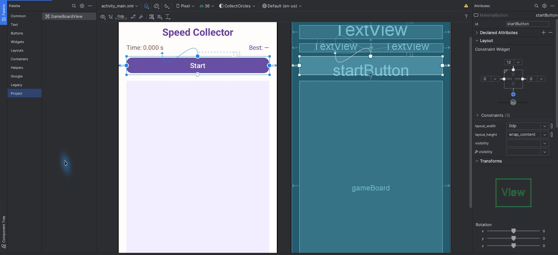
In the picture you also see layout_width="0dp" and the Constraint Widget in the Attributes window.
Set:
| Attribute | Value |
|---|---|
id |
gameBoard |
layout_width |
0dp |
layout_height |
0dp |
minHeight |
320dp |
Create four constraints:
- Connect the board’s left side to the parent’s left side.
- Connect the board’s right side to the parent’s right side.
- Connect its top to the bottom of
startButton. - Connect its bottom to the parent’s bottom.
Set:
- Top margin:
16dp; - Bottom margin:
20dp.
The height is also 0dp, so the board fills the remaining space between the button and the bottom.
GameBoardView paints its background from Java code. If you want to see the lavender color even when the preview fails to run the class, you can manually add:
tools:background="@color/board_background"
This is a preview-only property. It does not change the app at runtime.
8. Checking the constraints map
When finished, the constraints should match this map:
| Component | Horizontal | Vertical |
|---|---|---|
titleText |
left and right to the parent | top to the parent |
elapsedTimeText |
left to parent, right to bestTimeText |
under the title |
bestTimeText |
left to elapsedTimeText, right to parent |
baseline to the time label |
startButton |
left and right to the parent | under time |
gameBoard |
left and right to the parent | below the button to the bottom of the parent |
Click the warnings icon on the Layout Editor toolbar. There should be no Missing Constraints warning.
Don’t immediately click Infer Constraints to “fix everything”. It tries to guess by where you placed the components, and sometimes creates connections that are not suitable for other screens. In this exercise, the goal is to understand and create each connection ourselves.
9. Run and check resizing
Run the application and check:
- Title remains centered.
- Both time labels are on the same line.
- The button is stretched across.
- The game board gets all the remaining height.
In the Layout Editor, temporarily change the display device to a narrower or wider device. If the constraints are correct, the structure remains the same without moving components manually.
Common problems
The component jumps to a corner at runtime
It lacks a horizontal or vertical constraint. The free position in the editor is sometimes saved only in the tools:layout_editor_absoluteX and tools:layout_editor_absoluteY properties; These do not determine position at runtime.
The component stays small even though it is connected on both sides
Change layout_width from wrap_content to 0dp - Match Constraints.
The two time labels are at different heights
Delete the vertical constraint on bestTimeText, choose Show Baseline, and connect the two baselines.
GameBoardView does not appear in Palette
- Save the Java file.
- Do Build → Assemble Project.
- Fix Java errors if any.
- Open Palette → Project again.
- If
GameBoardViewstill does not appear after a successful build, save your work, close Android Studio and reopen the same project.
It is difficult to select a component because another component covers it
Select it from the Component Tree instead of clicking on it in the view.
If there are no Missing Constraints warnings and the screen also works correctly on another device display, you have built the ConstraintLayout using the GUI. Now you can go back to lesson 1 and concentrate on the drawing classes.
Further reading
Continue
Gemini tutor
Open Gem: CollectCircles Studio: Drawing and Playing to get hints, diagnostic questions and explanations appropriate to the stage you are at.